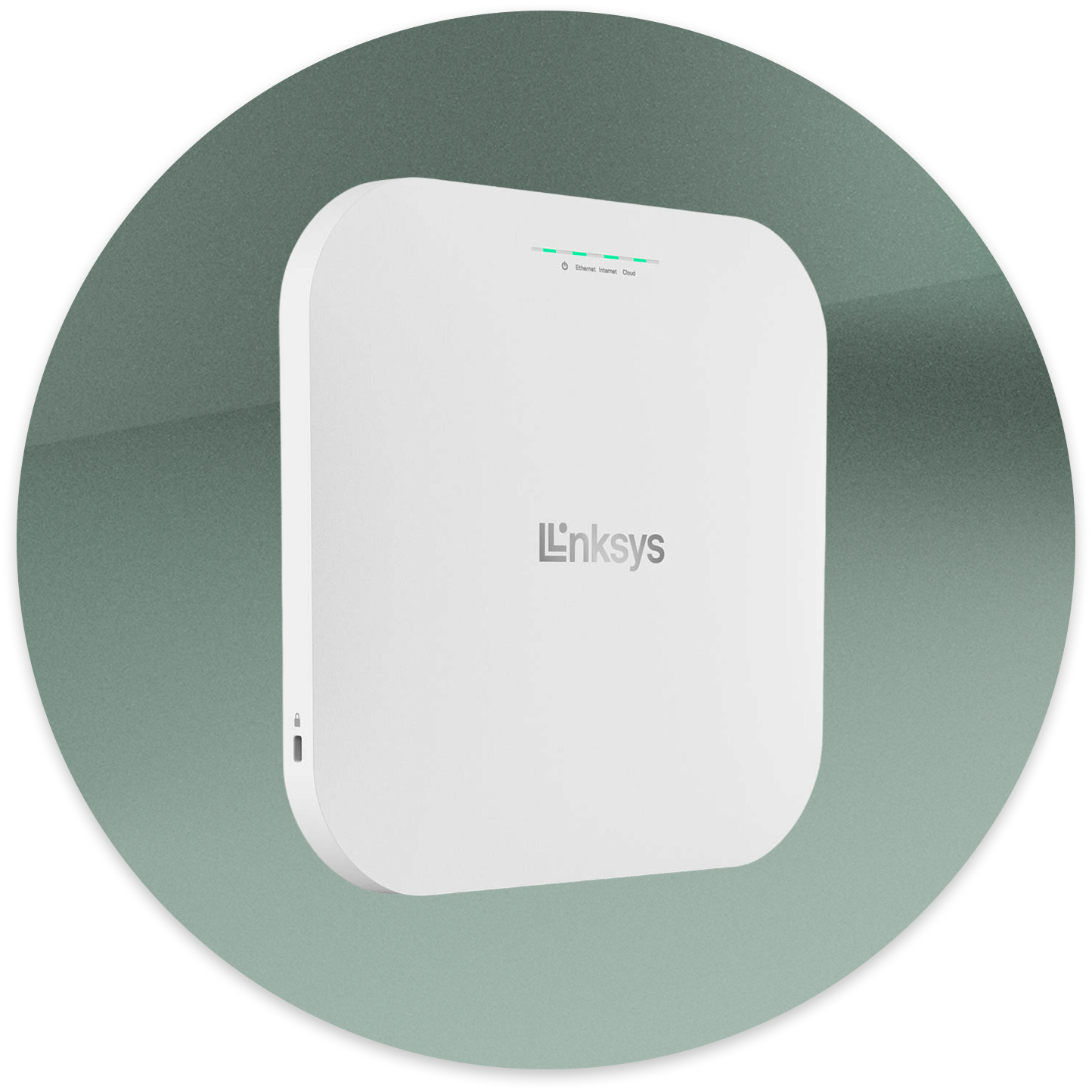
An enterprise platform for managing access points at scale
Think of an office building that provides internet for dozens of people: company employees, building personnel, or visitors.
These people groups need their own WiFi networks, with varied levels of security.
Linksys Cloud Manager offers a turn-key solution for network management via cloud-based web application.
In addition to basic network management, it made sense for Cloud Manager to solve for other internet-related scenarios.
eg: a university that wants a branded log in screen on all of a department’s computers
To support these cases, LCM has add-on services, billed à la carte.

Given the influx of remote workers after 2019, Linksys decided to launch “Linksys HomeWRK,” a solution to provide remote workers with upgraded network security and hardware.
HomeWRK would leverage our LCM platform, built as an add-on service.
The model
Companies with remote workers could order several hundred routers, upload their VPN information through Linksys Cloud Manager, and ship the routers directly to employees from the factory.
The product had to launch fast, so the strategy was to utilize Linksys Cloud Manager’s existing design as much as possible.
Compared to other add-on services, however, HomeWRK’s setup and management was way more complex.
In its beta release, HomeWRK’s PM was receiving consistent feedback that setting up and using HomeWRK was confusing.

The PM’s ask was for UX improvements to improve HomeWRK’s onboarding flow.
I started by creating a site map, studying the product’s hierarchy and structure.
Items that feel unintuitive are marked for a closer look.

With a better picture of the product’s structure, I moved to my 2nd artifact: interaction maps.
I like to make a list of user scenarios, step by step.
For me, interaction maps are similar to user flows but “zoomed out” more.
I want them to quickly chart me through a product, without getting too mired in the details.
I aim to to improve glanceability with whatever visual cues I can, especially for huddles with other departments.
eg: color coding user types
The maps should…
Confirm an interaction has a “closed loop.”
Reveal involvement from users types
Make connections between databases or user types
Help think through edge cases
Reveal requirements
They’re also helpful in showing what communication should occur, the where, and when.

Collaborating with our UX researcher, I provide a walkthrough of the prototype and what areas I’m testing.
The researcher administers the test in a 1on1 zoom session, leaving me free to observe and take notes. Testers are required to share their screen and talk aloud as they perform tasks.
Test recruitment was performed with usertesting.com, targeting IT personnel who had experience supporting remote workers.
Meanwhile, I wanted to collect specific feedback from the confused users.
Using Figma, I put together a prototype of the current implementation’s key flows.

Suggested improvements
Improvements would be tested with the same scenarios and recruitment tasks.

Final proposal
Change navigation structure to separate HomeWRK as its own product
Create a global settings area
Implement simple 1-2-3 step onboarding instructions
Reframe “HomeWRK settings” as “HomeWRK functions”
Misc terminology edits
Results
Given the early stage of the HomeWRK product, we could only rely on the beta testers’ continued feedback.
Our PM was confident in the improvements and gave the green light for implementation, reporting general improved usability.


